Unexpected living room color combinations work when the pairing is surprising but the placement is disciplined: one color owns the walls, one carries the furniture and rug, and one shows up only in pillows, art, and accents. These 15 unexpected living room color combinations give you that plan for each pairing — where every color goes on the sofa wall, rug, curtains, chairs, coffee table, TV wall, and lighting — plus paint names.
I learned this on my own sofa wall: I once painted a whole living room deep green, added a green sofa, curtains, and pillows, and the room looked like a cave. Next time the deep color stayed on one wall only, with a cream sofa and green just in the rug border and two pillows. Same color, different room.
The 60-30-10 Rule, Worked Through a Real Living Room
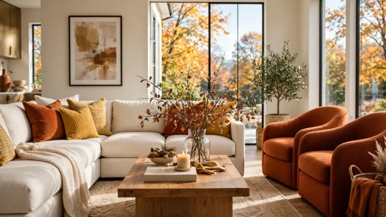
Living room wall color combinations only look designer when the ratio is planned: 60 percent dominant, 30 percent secondary, 10 percent accent. In a 14 by 18 foot living room, the 60 percent is warm white walls plus a cream sofa; the 30 percent, a terracotta rug, cream linen curtains, and one terracotta chair; the 10 percent, brass frames, two mustard throw pillows, and a black tray. An accent covering more than one chair plus pillows is no longer the accent.
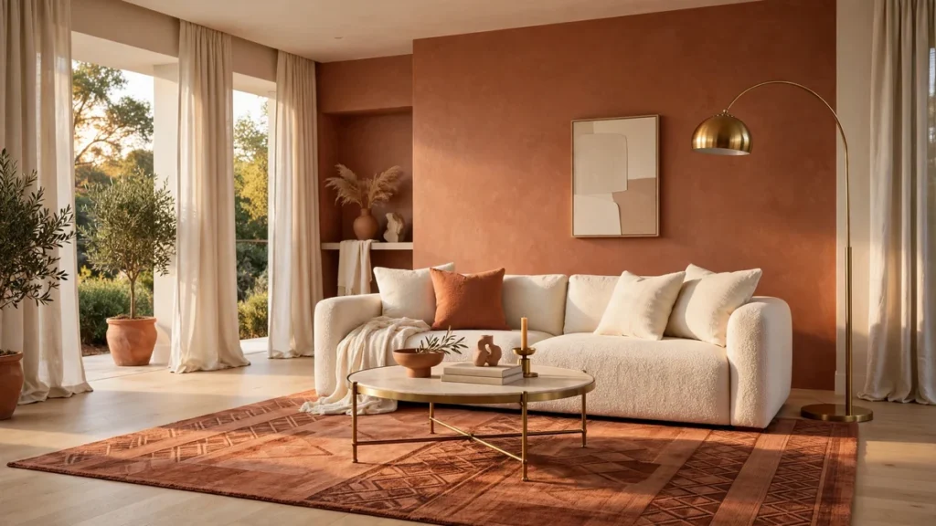
1. Terracotta and Cream Living Room
A terracotta and cream living room starts with warm white walls, a cream sofa, a terracotta rug and chair, and brass accents. Sample Burnished Clay in eggshell on the sofa wall only, Swiss Coffee elsewhere, and keep terracotta off the curtains.
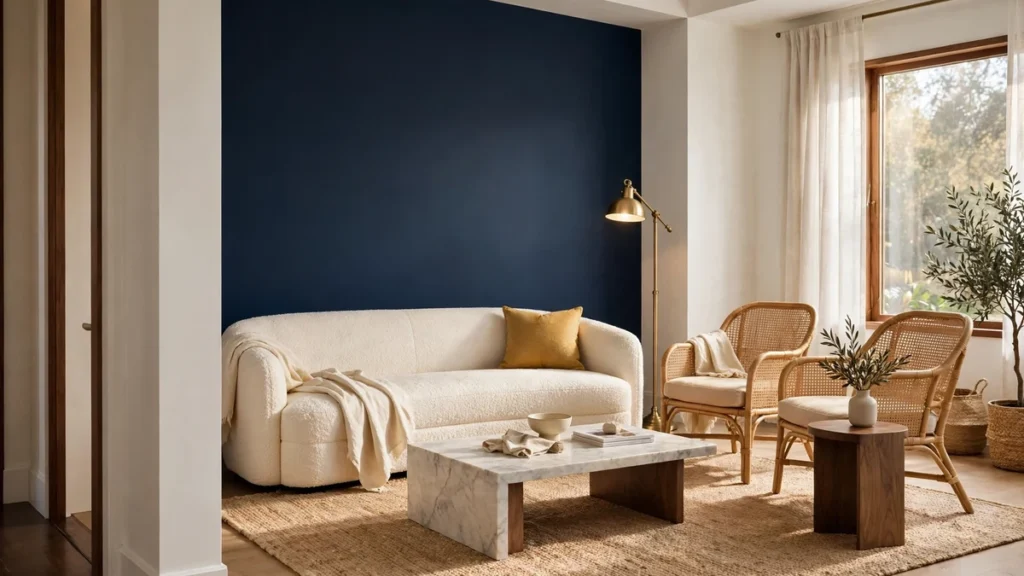
2. Navy and Warm White Living Room
A navy and warm white living room works because navy gets one wall and white gets everything else. Paint the sofa wall Hale Navy in eggshell, keep other walls warm white, and add a cream sofa, jute rug, rattan chairs, and one mustard pillow.
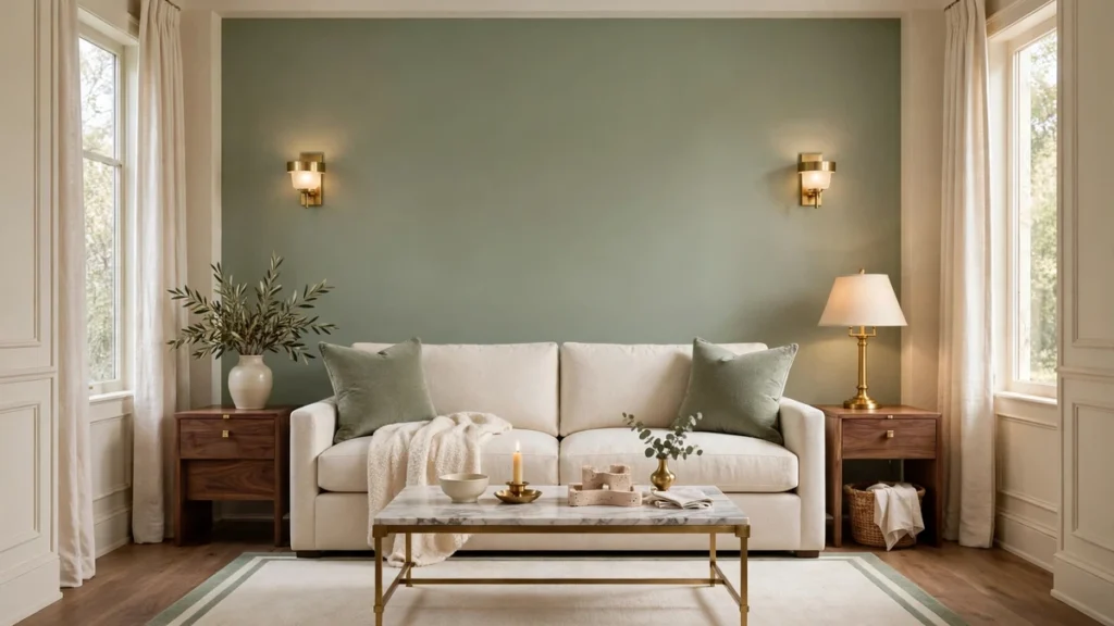
3. Sage Green and Cream Living Room
A sage green and cream living room is the calmest pairing here — and the easiest to get wrong by going too gray. Paint the sofa wall Sea Salt in eggshell, Alabaster cream elsewhere, and let a cream sofa, sage rug border, and two sage pillows carry the ratio. If the sample looks gray, switch to Dried Thyme.
For more green-led rooms, see these greenery bedroom ideas and sage green kitchen ideas.
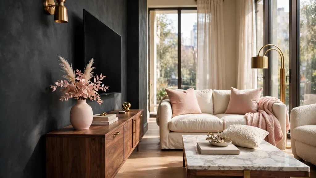
4. Charcoal and Blush Living Room
A charcoal and blush living room pairs a moody neutral with soft pink so neither reads cold or childish. Charcoal goes on the TV wall in matte; blush on cushions, one throw, and a vase; the sofa stays cream or light gray. Keep blush near 30 percent at most.
5. Olive Green and Cream and Black Living Room
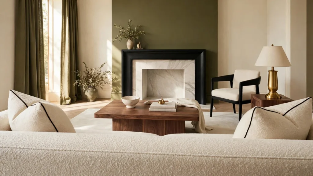
An olive green and cream and black living room uses black as punctuation, not the paragraph. Olive goes on one accent wall or the curtains, cream covers sofa and walls, black only in the mantel frame, one chair leg, and pillow piping. Keep black off the rug.
6. White and Black and Gold Living Room
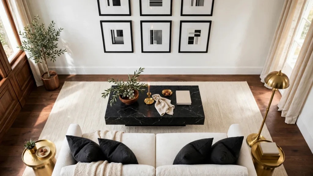
A white and black and gold living room is the most formal pairing here, and it lives or dies on the gold finish. White Dove walls in satin, a black coffee table and frames, and gold in exactly one finish — all brass, no mixed chrome. Keep the rug cream.
7. Mustard and Charcoal Living Room
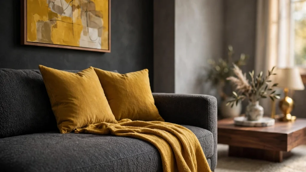
A mustard and charcoal living room works when mustard is the guest, not the host. Charcoal covers the sofa or TV wall, warm gray the other walls, and mustard appears in two throw pillows, one throw, and the art — never sofa and curtains together. Sample Agreeable Gray first.
8. Warm Gray and Mustard and Linen Living Room
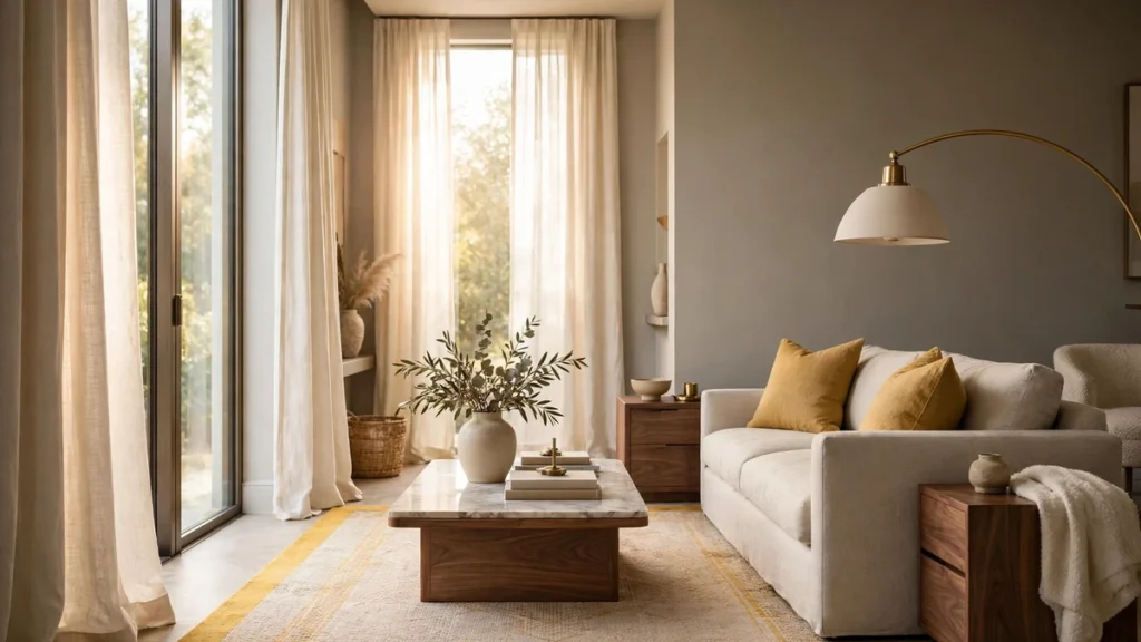
Gray living room color combinations turn flat with no warm partner, and mustard plus natural linen fix that. Gray walls, an oatmeal linen-look sofa, a mustard rug border or two mustard throw pillows, and cream linen curtains soften the wall. Safest for a north-facing room.
9. Classic Blue and White Living Room
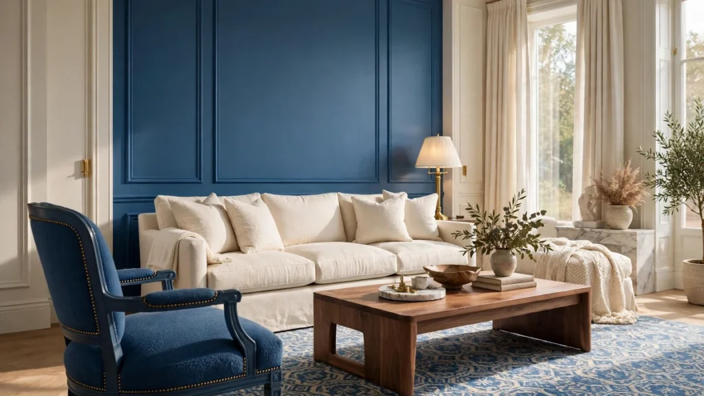
Blue living room color combinations work best when blue has one focal wall and white does the rest. Paint one wall classic blue in eggshell, keep sofa and walls white and cream, and let blue return in the rug pattern and one chair. A blue sofa plus blue walls plus blue curtains is the classic mistake.
10. Emerald Green and Black Living Room
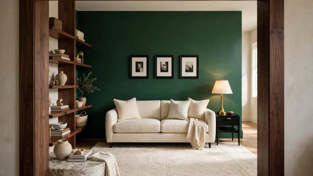
Emerald green living room color combinations look expensive when emerald stays deep and black stays small. Emerald goes on the sofa wall in eggshell — start with Creekside Green — black on frames and one side table, cream on sofa and rug. Brass accents keep it from going cold; skip emerald curtains.
11. Burgundy and Powder Blue Living Room
A burgundy and powder blue living room is the most unexpected pairing here: powder blue cools burgundy down. Burgundy goes on one accent chair and two throw pillows, powder blue on walls or curtains, cream holds sofa and rug. Sample Quixotic Plum in eggshell on one wall, never all four.
12. Charcoal and Cognac Living Room
A charcoal and cognac living room starts with the sofa, not the walls: a cognac leather sofa is the anchor, charcoal covers the TV wall or one accent wall, warm gray the rest. The rug is cream, the coffee table warm wood, accents black metal and one brass lamp. If your sofa is gray, skip this pairing.
13. Coastal Blue-Gray and Warm Sand and Whitewashed Wood Living Room
Light color combinations for a living room need a sand tone to keep them from washing out, and this coastal trio does that. Blue-gray goes on the sofa wall, warm sand covers rug and curtains, whitewashed wood on coffee table and frames. Best for a small living room.
14. Pale Lavender and Warm Cream and Walnut Living Room
A pale lavender and warm cream and walnut living room is the girly lane done quietly: lavender on two throw pillows and the art, warm cream on walls and sofa, walnut on coffee table and frames. Lavender never goes on the walls — as a 10 percent accent it reads designer, not sweet. Brass only in the lamp base.
15. Butter Yellow and Soft Gray and Washed Linen Living Room
A butter yellow and soft gray and washed linen living room is sunshine without glare. Soft gray covers the walls, butter yellow covers two throw pillows and one throw, washed linen covers sofa and curtains. Yellow on a whole wall is the mistake; as the 10 percent accent it warms the gray.
How to Sample Paint Before You Commit
Test every one of these unexpected living room color combinations the same way. Buy a paint swatch kit or sample pots, paint two 12 by 12 inch swatches — sofa wall and opposite window — and live with them for two days, checking morning, afternoon, and lamplight. Never pick from a phone screen.
The Undertone Test: Warm vs Cool Against Floors and Trim
Before buying a gallon, hold your swatch against floor and trim, not a white card. Warm undertones — yellow, red, peach — suit warm wood floors and cream trim; cool undertones — blue, gray, violet — suit gray floors and bright white trim. Tape the swatch to the wall, step back six feet, and check floor, trim, and swatch together — if one looks dirty next to the others, the undertone is wrong.
5 Mistakes to Avoid
First, clashing undertones: warm sofa, cool wall, and the room never settles. Second, too many bold colors at once: three bolds need a neutral referee: cream. Third, ignoring lighting: a north-facing room cools colors down, so go one shade warmer than the chip. Fourth, painting all four walls the bold color: one accent wall carries the drama, four walls carry the cave. Fifth, matching everything: sofa, rug, and curtains in one color flatten the room — repeat a color twice, then let a third answer it.
Budget, Renter, and Small Living Room Tricks
You do not need to repaint to try an unexpected pairing. Peel-and-stick wallpaper on one sofa wall tests a bold color with no landlord fight, and a textiles-only trial — pillow covers, a rug, and linen curtains — tests a combo for under a hundred dollars. When choosing living room furniture for a trial, start with the sofa: a light blue sofa pairs with warm white walls and a sand rug, no repainting needed. For a small living room, keep the bold color to one accent wall or accessories only, with a light ceiling and pale rug so the floor reads bigger.
The Girly Lane: Blush, Cream, and Brass
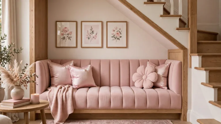
Most color lists lean neutral or masculine, and the blush, cream, and brass lane is wide open. Here it shows up in the charcoal and blush pairing, the pale lavender and cream pairing, and the blush accents inside the terracotta and cream room: blush as the 10 percent accent, cream as the base, brass as the single metal. Proportion keeps it designer, not sweet: blush never covers a whole wall, brass never mixes with chrome, cream always outnumbers pink.
Seasonal Accent Swaps: Change Only the 10 Percent
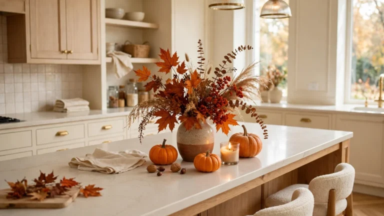
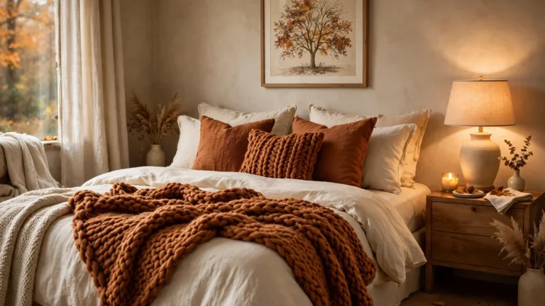
The cheapest way to refresh a living room color combination is to swap only the 10 percent accent and leave walls, sofa, and rug alone. Mustard throw pillows become blush in spring and burgundy in fall; one piece of art rotates. The 60 and 30 percent stay put, so the room reads as the same scheme, dressed for the season. Never repaint for a season — repaint when the base color stops working.
A Note Before You Style
The lesson: the pairing matters less than the placement. A surprising combination with a clear 60-30-10 plan looks intentional; a safe combination smeared everywhere looks accidental. Pick one of these unexpected living room color combinations, give the bold color one job, and test it in textiles before you open a paint can.
As an Amazon Associate, I earn from qualifying purchases. This post contains affiliate links: if you buy through them, I may earn a small commission at no extra cost to you.
What is the easiest unexpected living room color combination for a beginner?
Start with sage green and cream or terracotta and cream. Cream walls and sofa carry the room; the color needs only one wall, one rug, or a few pillows.
How do I use the 60-30-10 rule in a small living room?
Keep the 60 percent pale — warm white walls and a light sofa — put the 30 percent in rug and curtains, and let the bold color live only in the 10 percent: throw pillows, art, one chair. Dark walls work only as one accent wall.
Can I mix warm and cool colors in one living room?
Yes, if one undertone leads. Pick a warm or cool base for walls and sofa, then let the opposite undertone appear only in the 10 percent accent. Two competing undertones at full strength look unsettled.
What paint finish should I use on a living room accent wall?
Eggshell is safest: a soft glow without showing every bump, and it cleans better than matte. Satin on trim, semi-gloss only on doors and woodwork.
How do I test a bold color without repainting the whole room?
Use peel-and-stick wallpaper on one wall, or run a textiles-only trial — pillow covers, a rug, linen curtains — for a month. Still love it after thirty days? Then buy the paint.
Which living room color combination works best for a rental?
A textiles-only pairing: your cream walls, plus a rug, curtains, and throw pillows in terracotta and cream or sage and cream. Peel-and-stick wallpaper on one wall adds bold color, no landlord dispute.